Photo Essay / Social Media and Identity / Digital vs Print Narrative / Made with Adobe InDesign
Reflections on Finsta (and the persistence of a diary), 2024
What does it mean for a diary to persist in digital space? How does it proliferate? Is there an accurate way to represent digital elements and interactivity when digital space is lost?
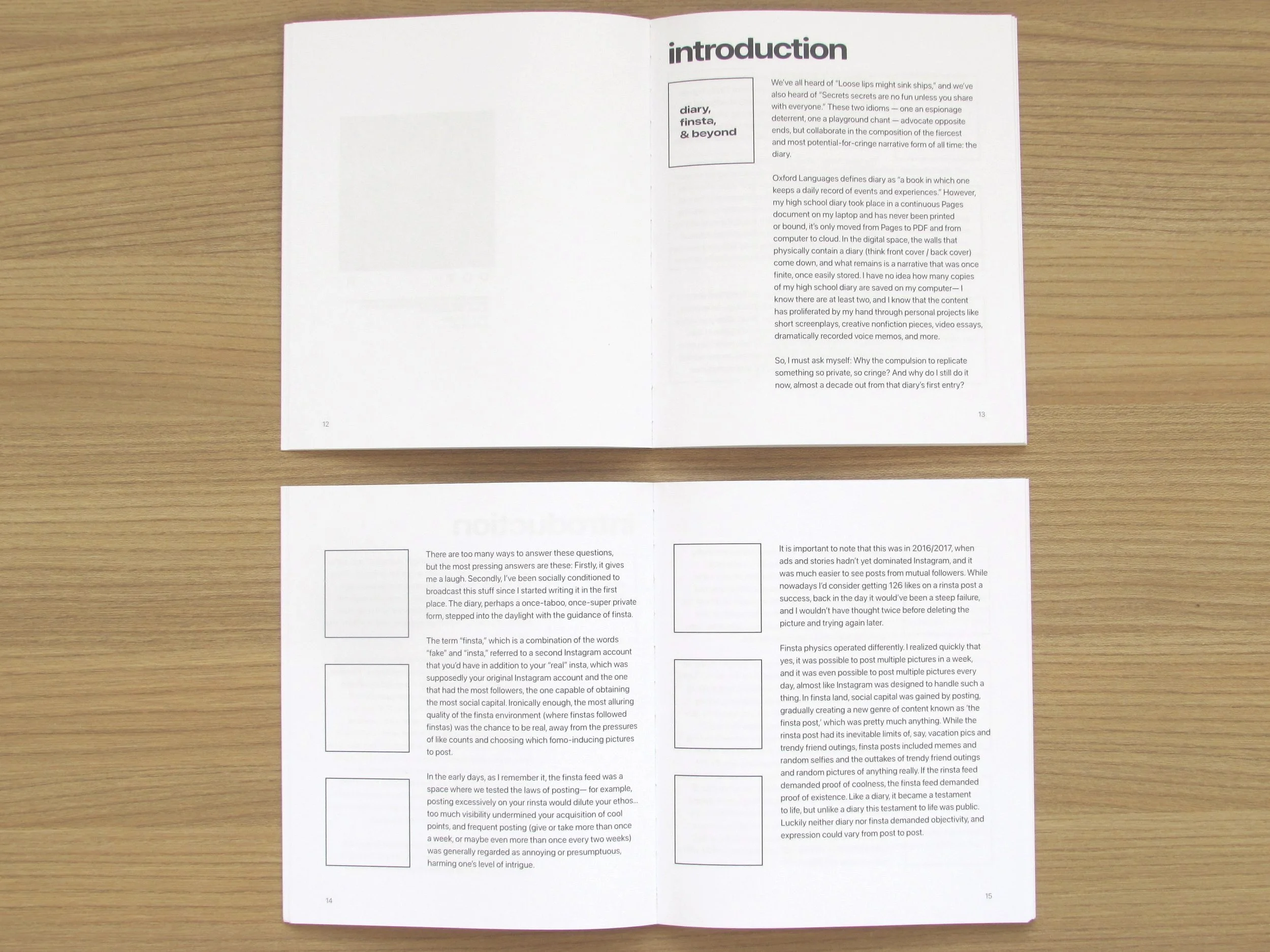
The term “finsta,” which is a combination of the words “fake” and “insta,” referred to a second Instagram account that you’d have in addition to your “real” insta (or rinsta), which was supposedly your original Instagram account and the one that had the most followers, the one capable of obtaining the most social capital. Ironically, the most alluring quality of the finsta environment (where finstas followed finstas) was the ability to be “real.”
Design Rationale, April 2024
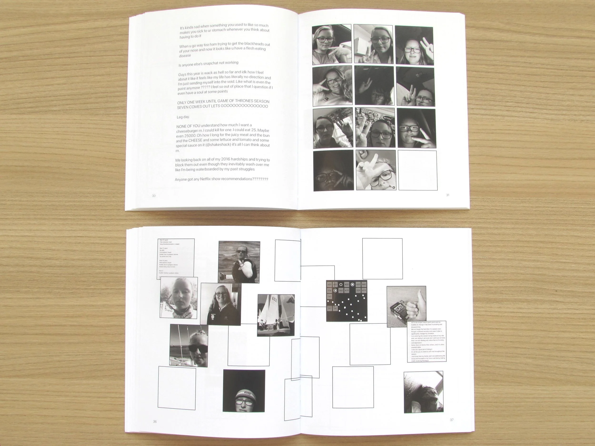
I kept the essay I wrote for this project separate from the pictures, and treated it as the introduction rather than the body of the work. This is because I realized that the body of the work is not necessarily my ‘reflection’ on finsta, it’s the finsta itself. While the introductory essay discusses the translation of diary into social media, the visual essay that follows is framed as just one of many interpretations and configurations of a social media account meeting the physical and chronological constraints of a book. In the design of this part, I was really curious about the dissolution of the grid, which is the main mode of organization on an Instagram profile, and at this point is more intuited rather than noticed. I wanted to show that the grid cannot be copied exactly into a book without losing the temporal and conceptual dimensions that is has in digital space. This is expressed visually in my design and configurations of the grid squares— some with images, some not, perhaps alluding to posts that were clicked on while scrolling, and posts that were overlooked. I also included captions from the posts (detached and out of order) to help with sequencing— some pages of captions follow a similar theme, while others are meant to show contrast, and maybe sprinkle some humor in there as well. With the captions and the pictures both detached from their proper counterparts, my goal was to show that narrative in digital space (specifically the profile) isn’t necessarily a clean beginning-to-end story. Instead it is wildly flexible, and can be remade countless times with the same material.
I set the dimensions for this book at 7x6, that way the square-ish shape could resonate with the images inside. For the font I chose Apple’s SF Pro, which is the default among Apple devices (mainly, in this case, Instagram captions). The color of the type takes on a grayish-blueish hue, which I think matches the black and white of some of the images, and, in all honesty, I thought it just felt right. Something about black type on the bright white page seemed too aggressive. The pictures in color are meant to add more thematic clarity, and maybe serve as a reminder that the finsta is not vintage, and that all of those pictures can still be accessed (in color!) in a matter of seconds. In a way, the color shift helps with chronology as well, both for the pictures themselves, and for the pacing of the book, maybe a “light at the end of the tunnel” effect.
Sample Layouts: