Found Texts / Risograph Printing / Collage
Visitor’s Map
From the colophon:
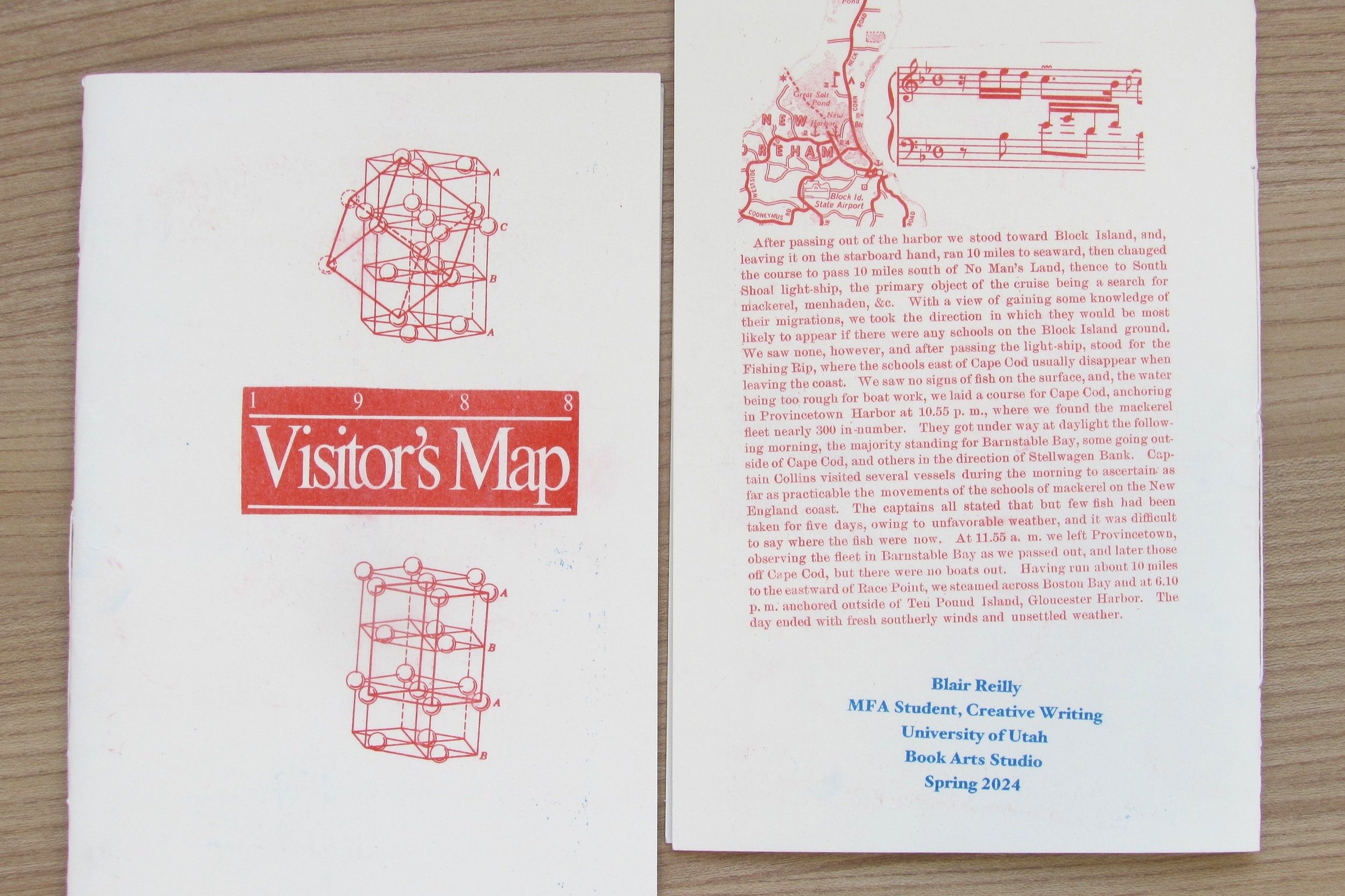
This book is made entirely out of found texts. None of the writing or images are my own. Special thanks to the 1988 Rhode Island Visitor’s Map, and to the 1880s fishing reports from the Albatross, who documented their trips to Rhode Island and the surrounding areas.
How many hands did these texts have to pass through to make it to mine? How important was it that I was in the right place at the right time to receive them? Fate is an unavoidable condition of writing.
Design Rationale, February 2024
This is my first book arts project, and it’s best contextualized by some of my main thematic concerns as a fiction writer, which include the search for order under the gaze of fate. While I didn’t necessarily have this in mind at the beginning of this book project, the materials I collected generally communicated those themes. A lot of the imagery and text you’ll find in my book are lists, maps, diagrams, and even music notes— things I’m drawn to regardless as a person, but things that are also indicative of a search for order and sensemaking. When I say “order” I don’t mean it in an authoritative sense, but more so in a curious, patterned sense. This pattern-searching is always volatile, and I enjoyed leaning into that volatility as I was working on this project, because to be totally honest, I had no clue what I was doing at the beginning.
The book’s title, along with the map sections and indexes in the book, come from a giant tourism map of Rhode Island, and the longer sections of text come from an 1880s fishing log. In terms of narrative, thinking too much about the pagination and imposition made me dizzy— I figured that if I’d come this far in terms of finding materials that directly relate to my writing interests (which honestly had to be fate— finding a giant map of Rhode Island and old Northeast fishing reports in a collageables bin in Utah was beyond exciting), then some kind of collaged narrative would emerge no matter what, mostly by the effort of the reader. I thought of how a map is read— usually with a purpose or goal, and sometimes aimlessly. Looking for the sake of looking, and associative meanings are made by the reader, not really a narrator. So, while my project may communicate these themes of ordering and fate-ness, I believe it does so by the contrasting forces of inattentiveness and wandering.
The artistic design of the book itself took me a while when finding the right color scheme— I ended up with blue ink on the grey/pashmina color page, with a red and off-white cover. I like the contrast between the cover and the pages— both are separate and speak for themselves, and maps usually don’t have covers. For the binding of the book I chose to stitch it— having never done book arts before I wanted to experience that physicality. I don’t know if I did a very good job! However, I figured that the stitching process mirrored the order/disorder theme, and whenever I got frustrated I just imagined I was someone from inside the world of the pages frantically trying to distribute a message.
Sample Layouts:


